Studio design
Studio design: Know the WHY behind every decision
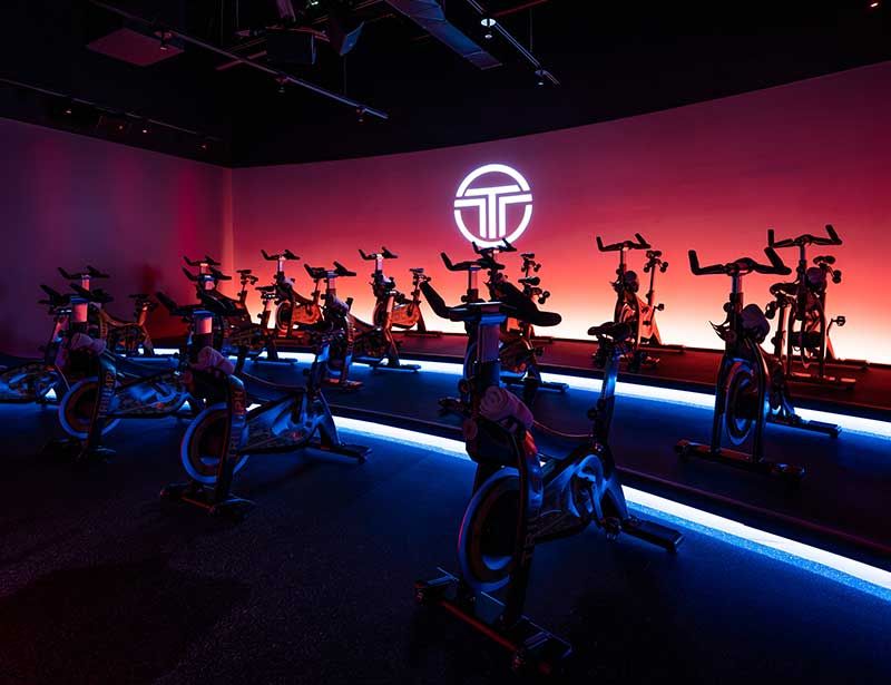
In today’s world of boutique fitness, whether standalone or club-in-club, indoor cycling studios are sanctuaries of ritual and community. Attendance becomes almost a religion among devoted fans. Symbols (logos) are worn with pride – a mark of identity and belonging. Devotees gather at the appointed time, showing unswerving loyalty to their guru – their chosen instructor.
And just as the world’s religions have their distinct stories to tell, so fitness studios have diversified and created their own philosophies to set themselves apart.
When working with new clients, our first question is always: ‘What do you believe?’
Where previously, indoor cycling looked similar the world over – go-getting, fitness-focused, push hard and then push harder – now distinct models are emerging to appeal to a multi-generational group of devotees. Amid messages of diversity and inclusion, new styles and formats have recast indoor cycling as ‘moving meditation’, spawning a new generation of studios where the focus is less on physical appearance and more on a lasting state of happiness and fulfilment.
It is the belief system, the ethos, the brand story that now distinguishes one cycling studio from another.
Design around the nuances
So, what does all this mean from a design perspective?
Just as architecture differs in form and function across houses of worship, so indoor cycling studios should also be designed based on the brand’s belief.
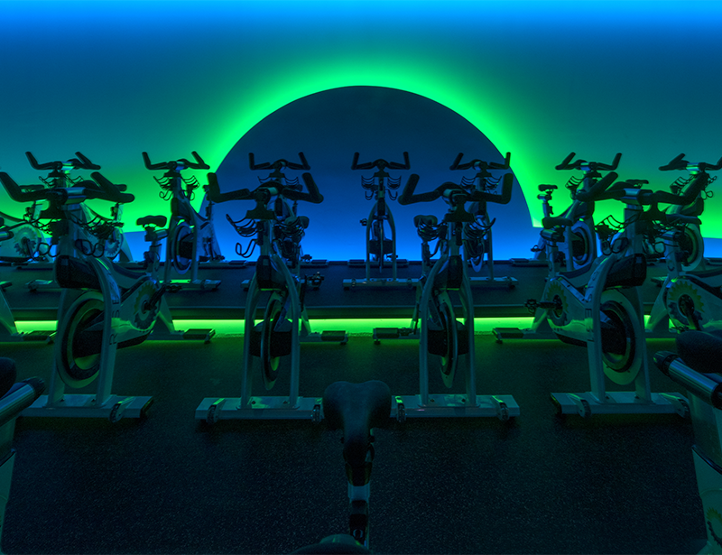
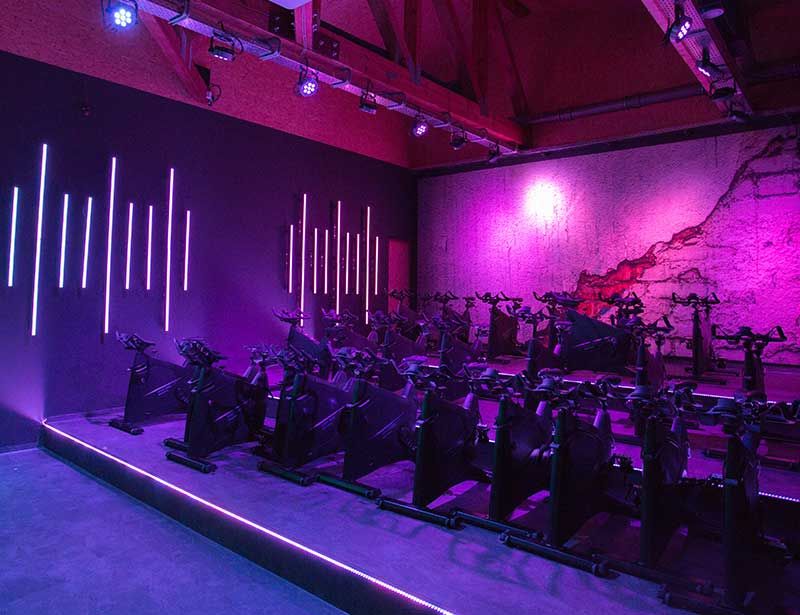
The studio design for a rhythm cycling class should be very different from the design for a performance class; trying to blend the needs of outdoor cyclists with those of choreography-based rhythm riders, all in one space, is where many studios fail.
IT’S NO ACCIDENT THATFLYWHEEL AND SOULCYCLEHAVE STARK CONTRASTSIN THEIR STUDIO DESIGN
But it isn’t impossible. With keen observation, meticulous planning and great creativity, we’ve been very successful in blending a variety of indoor cycling styles, delivering waitlisted classes and industry-crushing growth for our clients around the world.
Identify the contradictions
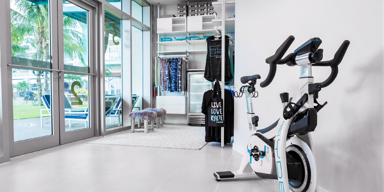
Think about the differences between SoulCycle and Flywheel. Before their division, all three founders had the same beliefs and philosophy. But now? Fly has screens and TorqBoards, Soul has candles and choreography. Soul distributes shoes from behind the front desk, Fly is a self-serve system with shoes in cubbies that correspond to the bike number. Sidebars and bikes on one level or stadium seating? There are reasons behind every decision, and it’s no accident that Flywheel and SoulCycle have stark contrasts in their studio design.
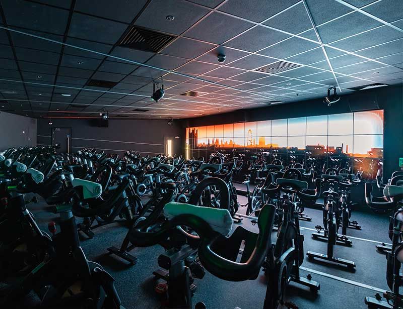
TVs and projection screens can be intrusive in a rhythm class, while the performance crowd enjoys friendly competition and checking stats on a leaderboard. Screens can also be useful for charity events, bride rides, birthday celebrations – yet they are considered “clutter” that contradict the digital detox offered by rhythm studios.
Ceiling or wall fans are mandatory for some studio owners, yet others believe fans cause arguments among instructors and members.
The true roadies and performance cyclists would be mortified to ride with a set of pink hand weights behind the saddle, yet others believe they are essential to the class format.
Even within the rhythm religion, there are contradictions: some teach freestyle with little resistance and an RPM over 120; others adhere to traditional form as certified by the likes of Mad Dogg or Schwinn.
WHY USE THE SAME DESIGN AND LANGUAGE AS YOUR COMPETITOR TO CLAIM HOW UNIQUE YOU ARE?
Chilled, scented towels after the finish line? Some believe in passing them out as a sweet reward – an integral part of a signature class. These studios require a discrete, flush-mounted small refrigerator inside the studio. Others believe towels are a waste of time and money and eliminate them all together. Problems arise when inconsistency creeps in and it’s a hit or miss amenity.
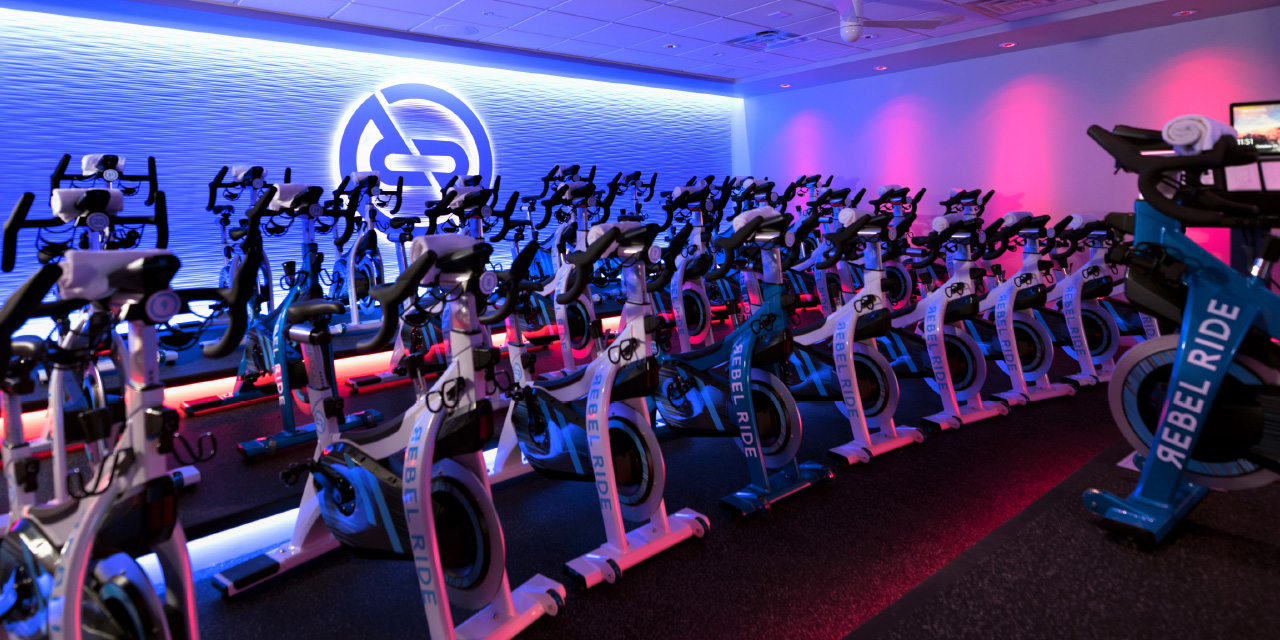
Many studio owners believe clients should come early and stay late. They need studios designed with generous social spaces to create a welcoming community – a home away from home. Others insist on small common areas to allow space for more bikes, which means getting people in and out quickly.
Ask yourself this…
Technical concerns such as sound mitigation, humidity control and reducing slippage will always be a top priority. However, when working with new clients, our first question is always: “What do you believe?”
We then design studios to reflect that belief, asking questions such as:
- Do you believe an instructor should help a client on the third row who comes unclipped or needs assistance during class? If yes, include extra space between rows so the instructor (or assistant) can quickly attend the need.
- Do you believe in occasional team rides with multiple instructors, or do you prefer to showcase only one instructor? The answer will determine the size and weight load of your podium/stage. It will also determine the number of microphones and channels your sound system requires.
- Do you believe instructors should control ceiling fans and dictate when (or if) they come on? If you’re eliminating ceiling fans altogether, know the logic behind this decision. If you’re installing fans, remember to allocate a no-fan zone so clients can reserve a bike away from, or directly under, the fans depending on their preference.
KNOW THE ‘WHY’ BEHIND EVERY DESIGN DECISION AND FIERCELY UPHOLD WHAT YOU BELIEVE
- Do you believe all bodies are the same shape and size? If yes, then place bikes with equal spacing between them. However, I would encourage you to think of an aeroplane, where different classes of seat have different spacing between them. The reasons are different in cycling studios, but there is arguably a similar need for variances in spacing. I’ve noticed that larger people and first-timers tend to take a place on the back row, so space bikes on this row further apart – it will make the lone wolves, and/or those who crave more space, feel more comfortable.
- To meet current social distancing requirements, why not remove the seat post of selected bikes rather than removing the bikes themselves? This keeps mass in the room for better sound; bikes can be rotated to receive equal usage.
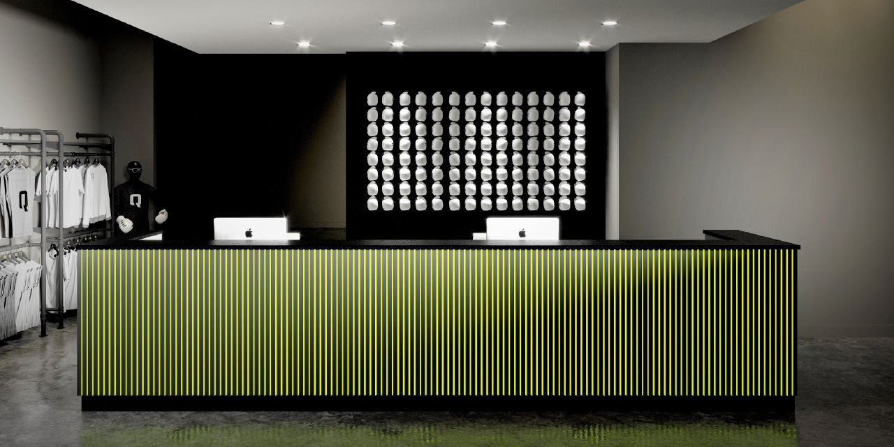
- During check-in at the reception desk, do you believe the first thing a client should see is the back of a computer screen or a smiling face?
- Do you believe cycling shoes should be complimentary or rented from you? This determines the best delivery system and location.
- How often will your studio turn the room for classes? If every 15 minutes, is your ventilation system designed to remove humidity and infuse fresh air, reducing odour and moisture? These are the questions you have to ask yourself in ‘normal’ times. Right now, of course, ventilation is even more critical – and complex – impacting not only riders’ comfort but also virus control. This is an area in which you must not cut corners.
- Do you believe clients should struggle to walk in cycling shoes? Slippage continues to be a cause of falls and potential lawsuits; sweat mixed with body lotion is a recipe for disaster on polished concrete floors.
- Does your brand have a signature scent? From grapefruit to lemon verbena, infuse a subtle yet memorable aroma into your studio space through a timed release in the ventilation system, for effective scent marketing.
There are no right or wrong answers to the above questions, but it is important to think about these details. You’d be surprised by how many people don’t. If you want your brand to inspire loyalty and ignite imagination, why would you use the same design style and brand language as your competitor to claim how unique you are?
Before hiring an architect or selecting a location, you must know the ‘why’ behind every design decision and fiercely uphold what you believe.
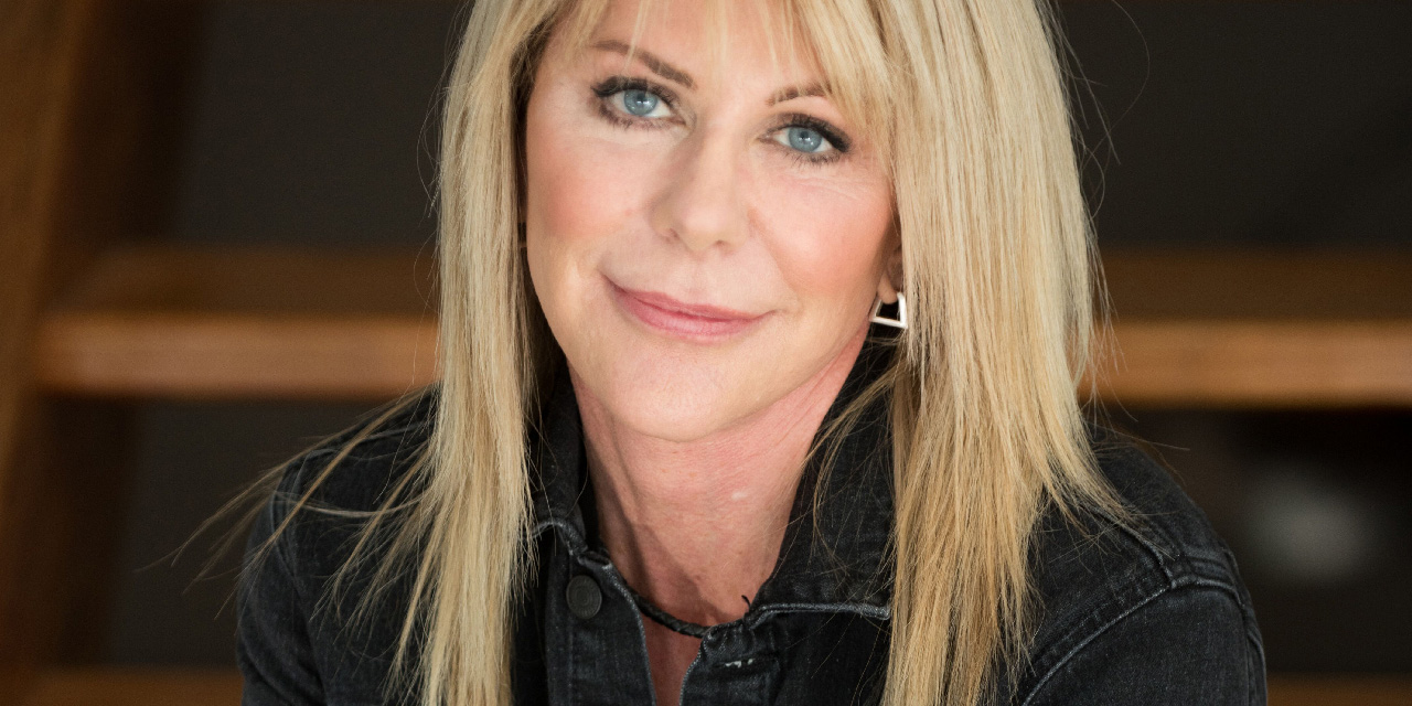
About the Barbara Chancey Design Group
“Unlike many traditional design firms, my entire team teaches, takes or observes classes relentlessly,” says Barbara Chancey, founder of the Barbara Chancey Design Group. “Our strength comes in designing beautifully functional spaces, approaching every brief through the eyes of instructors.
“Always mindful of the enormous effort it takes to fill a class, we include thoughtful features for instructors, with meticulous details to help them deliver a superior experience. This results in creative classes, increased retention, waitlists and industry-crushing growth for our clients.”
She continues: “When working with new clients, our first question is always: ‘What do you believe?’ We then create studio designs to reflect that belief – designs that reflect your brand and that are able to grow with you.
“In the words of Simon Sinek from his TED Talk on great leaders: ‘Hire people who believe what you believe, and you’ll never fail.’
“Studio owners, what do you believe?”

Conceived, powered and funded by BODY BIKE®, RIDE HIGH has a simple mission: to celebrate and champion the very best of indoor cycling, sharing ideas, stories and experiences from around the world to inspire the sector on to even bigger and better things. Subscribe for free by leaving your details below and we'll send indoor cycling's hottest news direct to your inbox three times a year.

